Typography
Use the following tags and classes to write a better description.
Headings
All HTML headings, <h1> through <h6>, are available.
<h1>Heading 1</h1>
<h2>Heading 2</h2>
<h3>Heading 3</h3>
<h4>Heading 4</h4>
<h5>Heading 5</h5>
<h6>Heading 6</h6>
Heading 1
Heading 2
Heading 3
Heading 4
Heading 5
Heading 6
Create lighter, secondary text in any heading with a generic <small> tag or the .small class.
<h1>Heading 1 <small>Small text</small></h1>
<h2>Heading 2 <small>Small text</small></h2>
<h3>Heading 3 <small>Small text</small></h3>
<h4>Heading 4 <small>Small text</small></h4>
<h5>Heading 5 <small>Small text</small></h5>
<h6>Heading 6 <small>Small text</small></h6>
Heading 1 Small text
Heading 2 Small text
Heading 3 Small text
Heading 4 Small text
Heading 5 Small text
Heading 6 Small text
Text colors
Use follwoing contextual classes to change color of your text.
<p>This is a normal paragraph without any contectual classes.</p>
<p class="txt-purple">A paragraph with .txt-purple class.</p>
<p class="txt-green">A paragraph with .txt-green class.</p>
<p class="txt-blue">A paragraph with .txt-blue class.</p>
<p class="txt-red">A paragraph with .txt-red class.</p>
<p class="txt-orange">A paragraph with .txt-orange class.</p>
<p class="txt-dark">A paragraph with .txt-dark class.</p>
<p class="txt-gray">A paragraph with .txt-gray class.</p>
<p class="txt-white bg-dark">A paragraph with .txt-white and .bg-dark class.</p>
This is a normal paragraph without any contectual classes.
A paragraph with .txt-purple class.
A paragraph with .txt-green class.
A paragraph with .txt-blue class.
A paragraph with .txt-red class.
A paragraph with .txt-orange class.
A paragraph with .txt-dark class.
A paragraph with .txt-gray class.
A paragraph with .txt-white and .bg-dark class.
Background colors
Use follwoing contextual classes to change background color of your text.
<p>This is a normal paragraph without any contectual classes.</p>
<p class="bg-purple">A paragraph with .bg-purple class.</p>
<p class="bg-green">A paragraph with .bg-green class.</p>
<p class="bg-blue">A paragraph with .bg-blue class.</p>
<p class="bg-orange">A paragraph with .bg-orange class.</p>
<p class="bg-red">A paragraph with .bg-red class.</p>
<p class="bg-dark">A paragraph with .bg-dark class.</p>
<p class="bg-dark-light">A paragraph with .bg-dark-light class.</p>
<p class="bg-dark-lighter">A paragraph with .bg-dark-lighter class.</p>
<p class="bg-dark-lightest">A paragraph with .bg-dark-lightest class.</p>
<p class="bg-gray">A paragraph with .bg-gray class.</p>
<p class="bg-gray-light">A paragraph with .bg-gray-light class.</p>
<p class="bg-gray-lighter">A paragraph with .bg-gray-lighter class.</p>
<p class="bg-gray-lightest">A paragraph with .bg-gray-lightest class.</p>
<p class="bg-white">A paragraph with .bg-white class.</p>
This is a normal paragraph without any contectual classes.
A paragraph with .bg-purple class.
A paragraph with .bg-green class.
A paragraph with .bg-blue class.
A paragraph with .bg-orange class.
A paragraph with .bg-red class.
A paragraph with .bg-dark class.
A paragraph with .bg-dark-light class.
A paragraph with .bg-dark-lighter class.
A paragraph with .bg-dark-lightest class.
A paragraph with .bg-gray class.
A paragraph with .bg-gray-light class.
A paragraph with .bg-gray-lighter class.
A paragraph with .bg-gray-lightest class.
A paragraph with .bg-white class.
Mark
Use <mark> tag or .highlight class to highlight a text.
<p>A sample of <mark>marked</mark> text.</p>
<p>A sample of <span class="highlight">highlighted</span> text.</p>
A sample of marked text.
A sample of highlighted text.
Small & lead
Use <small> tag or .small class to make a paragraph smaller, or make a paragraph stand out by adding .lead class.
<p class="lead">A sample lead paragraph.</p>
<p>A normal paragraph.</p>
<p class="small">A sample small paragraph.</p>
A sample lead paragraph.
A normal paragraph.
A sample small paragraph.
Blockquotes
Wrap <blockquote> around any HTML as the quote. For straight quotes, we recommend a <p>.
Lorem ipsum dolor sit amet, consectetur adipiscing elit. Integer posuere erat a ante.
<blockquote>
  <p>Lorem ipsum dolor sit amet, consectetur adipiscing elit. Integer posuere erat a ante.</p>
</blockquote>
Naming a source
Add a <footer> for identifying the source. Wrap the name of the source work in <cite>.
Lorem ipsum dolor sit amet, consectetur adipiscing elit. Integer posuere erat a ante.
<blockquote>
  <p>Lorem ipsum dolor sit amet, consectetur adipiscing elit. Integer posuere erat a ante.</p>
  <footer>Someone famous in <cite title="Source Title">Source Title</cite></footer>
</blockquote>
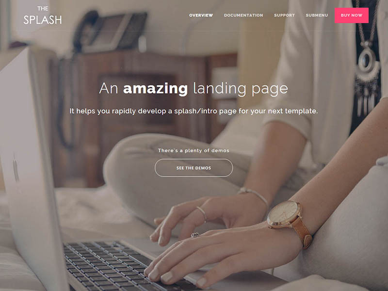
Header
Give some information about the current page with image and descriptions.
Basic style
You can see different types of header in demos. You'd be able to have an image backgrounded banner or just a solid color background. Setting background is like how you can add them in sections.
Following code snippet demonstrates .site-header of demo #6. As you can see, it's easy to grasp the code.
<!-- Site header -->
<header class="site-header color-alt overlay-black size-full text-center" style="background-image: url(assets/img/bg-page.jpg)">
  <div class="container">
    <h1>An <strong>amazing</strong> landing page</h1>
    <h4>It helps you rapidly develop a splash/intro page for your next template.</h4>
    <br><br><br>
    <h6>There's a plenty of demos</h6>
    <a class="btn btn-lg btn-white btn-outline btn-round" href="#demos"><span style="padding: 0 30px;">See the demos</span></a>
  </div>
</header>
<!-- END Site header -->
Available classes
You can apply any of the following classes to .site-header.
| Class name | Description |
|---|---|
overlay-black |
A black-color overlay with %33 opacity to make a better contrast between text and background image. |
overlay-white |
A white-color overlay with %33 opacity to make a better contrast between text and background image. |
overlay-intense |
Increase the overlay opacity to %55. You need to apply this class with one of the previous classes. |
bg-repeat |
It'll repeat your background image. |
bg-fixed |
It'll apply background-attachment: fixed rule to have a parallax-like effect. |
size-sm |
By default, padding-top and padding-bottom is equal to 120px. Applying this class will change it to 60px. |
size-lg |
By default, padding-top and padding-bottom is equal to 120px. Applying this class will change it to 180px. |
size-full |
It'll make the header full height by applying height: 100vh. |
color-alt |
Change the text-colors to white. |
Sections
Split your page to different parts and describe each of those inside a section tag.
Header
You can see sample header almost in every section of this documentation. The header of this section uses following code:
<header class="section-header">
  <span>Content decoupling</span>
  <h2>Sections</h2>
  <p>Split your page to different parts and describe each of those inside a section tag.</p>
</header>
Alignment
By default, the header is center aligned. But you can easily change the text alignment by using .text-left or .text-right with header tag.
Sections
Split your page to different parts and describe each of those inside a section tag.
<header class="section-header text-left">
  <span>Content decoupling</span>
  <h2>Sections</h2>
  <p>Split your page to different parts and describe each of those inside a section tag.</p>
</header>
Background
You have a plenty of option to modify background of a section.
Color
By default, background-color is white, but you can use following classes with a section tag to modify its background-color.
<section class="bg-gray-light">
  ...
</section>
- .bg-purple
- .bg-green
- .bg-blue
- .bg-orange
- .bg-red
- .bg-dark
- .bg-dark-light
- .bg-dark-lighter
- .bg-dark-lightest
- .bg-gray
- .bg-gray-light
- .bg-gray-lighter
- .bg-gray-lightest
Also, you can always change background-color using inline style:
<section style="background-color: #123456">
  ...
</section>
Image
Easily add a background-image to a section using inline style:
<section style="background-image: url(path/to/image.png)">
  ...
</section>
Or take advantage of your assets/css/custom.css file and make a class for each background-image:
.bg-img-sec-about {
  background-image: url(../img/bg-about.png);
}
<section class="bg-img-sec-about">
  ...
</section>
Video
You can easily add a video to background of sections.
<section>
  <video class="bg-video" autoplay loop>
    <source src="assets/img/video.mp4" type="video/mp4">
    <source src="assets/img/video.webm" type="video/webm">
  </video>
</section>
Overlay
It's always a good practice to accompany background images and videos with an overly class to make a better contrast between background and texts. You have .overlay-black and .overlay-white classes to use with sections. Also, you can increase or decrease their opacity by adding .overlay-intense and .overlay-pale respectively.
Helper classes
Here's some helper classes that you can add to any section to make a small change in it.
| Class name | Description |
|---|---|
.no-border-bottom |
Sections have an 1px border-bottom. Adding this class would remove the border. |
.section-sm |
By default, each section has 96px padding in top and bottom. This class will change it to 48px. |
.section-lg |
By default, each section has 96px padding in top and bottom. This class will change it to 164px. |
.bg-repeat |
This class can be useful when you're using a pattern-based background image and you'd like to repeat it all over the section. |
Also, you can use general helper classes as well.
Images
Here's a bunch of classes that you can use with your images.
<img src="assets/img/screenshot.jpg" alt="image">
<img class="img-rounded" src="assets/img/screenshot.jpg" alt="image">
<img class="img-circle" src="assets/img/screenshot.jpg" alt="image">

<img class="img-thumbnail" src="assets/img/screenshot.jpg" alt="image">
<img class="img-bordered" src="assets/img/screenshot.jpg" alt="image">
<img class="img-shadowed" src="assets/img/screenshot.jpg" alt="image">
<img class="img-shadow" src="assets/img/screenshot.jpg" alt="image">
<img class="img-fade" src="assets/img/screenshot.jpg" alt="image">
<img class="img-zoom" src="assets/img/screenshot.jpg" alt="image">
Demos
Easily show demos of your template in the landing page and let the visitor select a desired one
Apart from designing grid based images for your demos and using image filters with the, you have some special demo blocks to use.
Scrolling image
<ul class="demos">
  <li>
    <a href="#">
      <span class="img-scroll" style="background-image: url(assets/img/screenshot-long.jpg)"></span>
    </a>
    <h4 class="text-center">Sample demo</h4>
  </li>

  <li>
    <a href="#">
      <span class="img-scroll" style="background-image: url(assets/img/screenshot-long.jpg)"></span>
    </a>
    <h4 class="text-center">Sample demo</h4>
  </li>

  <li>
    <a href="#">
      <span class="img-scroll" style="background-image: url(assets/img/screenshot-long.jpg)"></span>
    </a>
    <h4 class="text-center">Sample demo</h4>
  </li>
</ul>
Preview icon
-
Sample demo
-
Sample demo
-
Sample demo
<ul class="demos">
  <li>
    <div class="item">
      <a class="preview-icon" href="#">
        <img src="assets/img/screenshot2.jpg" alt="screenshot">
      </a>
      <h4 class="text-center">Sample demo</h4>
    </div>
  </li>

  <li>
    <div class="item">
      <a class="preview-icon" href="#">
        <img src="assets/img/screenshot2.jpg" alt="screenshot">
      </a>
      <h4 class="text-center">Sample demo</h4>
    </div>
  </li>

  <li>
    <div class="item">
      <a class="preview-icon" href="#">
        <img src="assets/img/screenshot2.jpg" alt="screenshot">
      </a>
      <h4 class="text-center">Sample demo</h4>
    </div>
  </li>
</ul>
Preview buttons
-
Sample demo
-
Sample demo
-
Sample demo
<ul class="demos">
  <li>
    <div class="item">
      <div class="preview-btn">
        <img src="assets/img/screenshot2.jpg" alt="screenshot">
        <div class="buttons">
          <a class="btn btn-float btn-lg" href="#" target="_blank"><i class="fa fa-search"></i></a>
        </div>
      </div>
      <h4 class="text-center">Sample demo</h4>
    </div>
  </li>

  <li>
    <div class="item">
      <div class="preview-btn">
        <img src="assets/img/screenshot2.jpg" alt="screenshot">
        <div class="buttons">
          <a class="btn" href="#" target="_blank">View Demo</a>
        </div>
      </div>
      <h4 class="text-center">Sample demo</h4>
    </div>
  </li>

  <li>
    <div class="item">
      <div class="preview-btn">
        <img src="assets/img/screenshot2.jpg" alt="screenshot">
        <div class="buttons">
          <a class="btn btn-round" href="#" target="_blank">HTML</a>
          <a class="btn btn-round" href="#" target="_blank">Angular</a>
        </div>
      </div>
      <h4 class="text-center">Sample demo</h4>
    </div>
  </li>
</ul>
Descriptive
This type is like the first style of TheSplash. You can see a basic code in following code snippet.
<ul class="demos cols-2">
  <li>
    <a class="media" href="#">
      <img src="assets/img/screenshot2.jpg" alt="screenshot">
    </a>
    <div class="desc">
      <h5>Sample demo</h5>
      <p>This is the simplest demo available; only header, footer, and demos.</p>
      <br>
      <p>
        <a class="btn" href="#">Demo</a>
        <a class="btn" href="#">Builder</a>
      </p>
    </div>
  </li>
</ul>
Featured box
Present key features of your product in overview page
Iconic
Here's some examples that uses icon in feature boxes.
Default
-
Responsive
Donec efficitur mi a velit tincidunt, sit amet accumsan nibh congue. Aliquam convallis molestie ligula.
-
Customizable
Donec efficitur mi a velit tincidunt, sit amet accumsan nibh congue. Aliquam convallis molestie ligula.
-
Full of features
Donec efficitur mi a velit tincidunt, sit amet accumsan nibh congue. Aliquam convallis molestie ligula.
<ul class="features">
  <li>
    <div class="icon"><i class="fa fa-mobile"></i></div>
    <h5>Responsive</h5>
    <p>Donec efficitur mi a velit tincidunt, sit amet accumsan nibh congue. Aliquam convallis molestie ligula.</p>
  </li>

  <li>
    <div class="icon"><i class="fa fa-cog"></i></div>
    <h5>Customizable</h5>
    <p>Donec efficitur mi a velit tincidunt, sit amet accumsan nibh congue. Aliquam convallis molestie ligula.</p>
  </li>

  <li>
    <div class="icon"><i class="fa fa-code"></i></div>
    <h5>Full of features</h5>
    <p>Donec efficitur mi a velit tincidunt, sit amet accumsan nibh congue. Aliquam convallis molestie ligula.</p>
  </li>
</ul>
Round
Adding .icon-round to the .features tag.
-
Responsive
Donec efficitur mi a velit tincidunt, sit amet accumsan nibh congue. Aliquam convallis molestie ligula.
-
Customizable
Donec efficitur mi a velit tincidunt, sit amet accumsan nibh congue. Aliquam convallis molestie ligula.
-
Full of features
Donec efficitur mi a velit tincidunt, sit amet accumsan nibh congue. Aliquam convallis molestie ligula.
<ul class="features icon-round">
  <li>
    <div class="icon"><i class="fa fa-mobile"></i></div>
    <h5>Responsive</h5>
    <p>Donec efficitur mi a velit tincidunt, sit amet accumsan nibh congue. Aliquam convallis molestie ligula.</p>
  </li>

  <li>
    <div class="icon"><i class="fa fa-cog"></i></div>
    <h5>Customizable</h5>
    <p>Donec efficitur mi a velit tincidunt, sit amet accumsan nibh congue. Aliquam convallis molestie ligula.</p>
  </li>

  <li>
    <div class="icon"><i class="fa fa-code"></i></div>
    <h5>Full of features</h5>
    <p>Donec efficitur mi a velit tincidunt, sit amet accumsan nibh congue. Aliquam convallis molestie ligula.</p>
  </li>
</ul>
Sided
Adding .icon-sided to the .features tag.
-
Responsive
Donec efficitur mi a velit tincidunt, sit amet accumsan nibh congue. Aliquam convallis molestie ligula.
-
Customizable
Donec efficitur mi a velit tincidunt, sit amet accumsan nibh congue. Aliquam convallis molestie ligula.
-
Full of features
Donec efficitur mi a velit tincidunt, sit amet accumsan nibh congue. Aliquam convallis molestie ligula.
<ul class="features icon-sided">
  <li>
    <div class="icon"><i class="fa fa-mobile"></i></div>
    <h5>Responsive</h5>
    <p>Donec efficitur mi a velit tincidunt, sit amet accumsan nibh congue. Aliquam convallis molestie ligula.</p>
  </li>

  <li>
    <div class="icon"><i class="fa fa-cog"></i></div>
    <h5>Customizable</h5>
    <p>Donec efficitur mi a velit tincidunt, sit amet accumsan nibh congue. Aliquam convallis molestie ligula.</p>
  </li>

  <li>
    <div class="icon"><i class="fa fa-code"></i></div>
    <h5>Full of features</h5>
    <p>Donec efficitur mi a velit tincidunt, sit amet accumsan nibh congue. Aliquam convallis molestie ligula.</p>
  </li>
</ul>
Name only
Adding .name-only to the .features tag.
-
HTML5 & CSS3
-
Bootstrap v3.3
-
Responsive design
-
Developer-friendly
-
23
HTML pages
-
10+
Demos
-
30+
Components
-
20+
Unique sections
-
Fully Documented
-
Free updates
-
Easy to customize
-
Unlimited colors
<ul class="features name-only cols-4">
<li style="height: 132px;">
<div class="icon"><i class="fa fa-html5"></i></div>
<h5>HTML5 & CSS3</h5>
</li>
<li style="height: 132px;">
<div class="icon"><i class="fa fa-bold"></i></div>
<h5>Bootstrap v3.3</h5>
</li>
<li style="height: 132px;">
<div class="icon"><i class="fa fa-tv"></i></div>
<h5><strong>Responsive</strong> design</h5>
</li>
<li style="height: 132px;">
<div class="icon"><i class="fa fa-code"></i></div>
<h5>Developer-friendly</h5>
</li>
<li style="height: 132px;">
<div class="icon">23</div>
<h5>HTML pages</h5>
</li>
<li style="height: 132px;">
<div class="icon">10+</div>
<h5>Demos</h5>
</li>
<li style="height: 132px;">
<div class="icon">30+</div>
<h5>Components</h5>
</li>
<li style="height: 132px;">
<div class="icon">20+</div>
<h5>Unique sections</h5>
</li>
<li style="height: 132px;">
<div class="icon"><i class="fa fa-file-text-o"></i></div>
<h5>Fully <strong>Documented</strong></h5>
</li>
<li style="height: 132px;">
<div class="icon"><i class="fa fa-refresh"></i></div>
<h5>Free updates</h5>
</li>
<li style="height: 132px;">
<div class="icon"><i class="fa fa-cogs"></i></div>
<h5>Easy to customize</h5>
</li>
<li style="height: 132px;">
<div class="icon"><i class="fa fa-paint-brush"></i></div>
<h5>Unlimited colors</h5>
</li>
</ul>
Change color
You can easily change fore-color or background-color of icons using .txt-* and .bg-* classes which described in typography section.
Image
It's possible to use an image instead of icons. You need to add .icon-image class. Check samples.
-
Responsive
Donec efficitur mi a velit tincidunt, sit amet accumsan nibh congue. Aliquam convallis molestie ligula.
-
Customizable
Donec efficitur mi a velit tincidunt, sit amet accumsan nibh congue. Aliquam convallis molestie ligula.
-
Full of features
Donec efficitur mi a velit tincidunt, sit amet accumsan nibh congue. Aliquam convallis molestie ligula.
<ul class="features icon-image">
  <li>
    <div class="icon"><img src="assets/img/screenshot.jpg" alt="placeholder"></div>
    <h5>Responsive</h5>
    <p>Donec efficitur mi a velit tincidunt, sit amet accumsan nibh congue. Aliquam convallis molestie ligula.</p>
  </li>

  <li>
    <div class="icon"><img src="assets/img/screenshot.jpg" alt="placeholder"></div>
    <h5>Customizable</h5>
    <p>Donec efficitur mi a velit tincidunt, sit amet accumsan nibh congue. Aliquam convallis molestie ligula.</p>
  </li>

  <li>
    <div class="icon"><img src="assets/img/screenshot.jpg" alt="placeholder"></div>
    <h5>Full of features</h5>
    <p>Donec efficitur mi a velit tincidunt, sit amet accumsan nibh congue. Aliquam convallis molestie ligula.</p>
  </li>
</ul>
Sided image
-
Responsive
Donec efficitur mi a velit tincidunt, sit amet accumsan nibh congue. Aliquam convallis molestie ligula.
-
Customizable
Donec efficitur mi a velit tincidunt, sit amet accumsan nibh congue. Aliquam convallis molestie ligula.
-
Full of features
Donec efficitur mi a velit tincidunt, sit amet accumsan nibh congue. Aliquam convallis molestie ligula.
-
Well documented
Donec efficitur mi a velit tincidunt, sit amet accumsan nibh congue. Aliquam convallis molestie ligula.
<ul class="features icon-image-sided cols-2">
  <li>
    <div class="icon"><img class="img-bordered" src="assets/img/screenshot.jpg" alt="placeholder"></div>
    <h5>Responsive</h5>
    <p>Donec efficitur mi a velit tincidunt, sit amet accumsan nibh congue. Aliquam convallis molestie ligula.</p>
  </li>

  <li>
    <div class="icon"><img class="img-bordered" src="assets/img/screenshot.jpg" alt="placeholder"></div>
    <h5>Customizable</h5>
    <p>Donec efficitur mi a velit tincidunt, sit amet accumsan nibh congue. Aliquam convallis molestie ligula.</p>
  </li>

  <li>
    <div class="icon"><img class="img-bordered" src="assets/img/screenshot.jpg" alt="placeholder"></div>
    <h5>Full of features</h5>
    <p>Donec efficitur mi a velit tincidunt, sit amet accumsan nibh congue. Aliquam convallis molestie ligula.</p>
  </li>

  <li>
    <div class="icon"><img class="img-bordered" src="assets/img/screenshot.jpg" alt="placeholder"></div>
    <h5>Well documented</h5>
    <p>Donec efficitur mi a velit tincidunt, sit amet accumsan nibh congue. Aliquam convallis molestie ligula.</p>
  </li>
</ul>
With border
-
Responsive
Donec efficitur mi a velit tincidunt, sit amet accumsan nibh congue. Aliquam convallis molestie ligula.
-
Customizable
Donec efficitur mi a velit tincidunt, sit amet accumsan nibh congue. Aliquam convallis molestie ligula.
-
Full of features
Donec efficitur mi a velit tincidunt, sit amet accumsan nibh congue. Aliquam convallis molestie ligula.
<ul class="features icon-image">
  <li>
    <div class="icon"><img class="img-thumbnail" src="assets/img/screenshot.jpg" alt="placeholder"></div>
    <h5>Responsive</h5>
    <p>Donec efficitur mi a velit tincidunt, sit amet accumsan nibh congue. Aliquam convallis molestie ligula.</p>
  </li>

  <li>
    <div class="icon"><img class="img-thumbnail" src="assets/img/screenshot.jpg" alt="placeholder"></div>
    <h5>Customizable</h5>
    <p>Donec efficitur mi a velit tincidunt, sit amet accumsan nibh congue. Aliquam convallis molestie ligula.</p>
  </li>

  <li>
    <div class="icon"><img class="img-thumbnail" src="assets/img/screenshot.jpg" alt="placeholder"></div>
    <h5>Full of features</h5>
    <p>Donec efficitur mi a velit tincidunt, sit amet accumsan nibh congue. Aliquam convallis molestie ligula.</p>
  </li>
</ul>
Action button
You may need to use a button with a feature.
-
Responsive
Donec efficitur mi a velit tincidunt, sit amet accumsan nibh congue. Aliquam convallis molestie ligula.
Learn more -
Customizable
Donec efficitur mi a velit tincidunt, sit amet accumsan nibh congue. Aliquam convallis molestie ligula.
Learn more -
Full of features
Donec efficitur mi a velit tincidunt, sit amet accumsan nibh congue. Aliquam convallis molestie ligula.
Learn more
<ul class="features">
  <li>
    <h5>Responsive</h5>
    <p>Donec efficitur mi a velit tincidunt, sit amet accumsan nibh congue. Aliquam convallis molestie ligula.</p>
    <a class="btn" href="#">Learn more</a>
  </li>

  <li>
    <h5>Customizable</h5>
    <p>Donec efficitur mi a velit tincidunt, sit amet accumsan nibh congue. Aliquam convallis molestie ligula.</p>
    <a class="btn" href="#">Learn more</a>
  </li>

  <li>
    <h5>Full of features</h5>
    <p>Donec efficitur mi a velit tincidunt, sit amet accumsan nibh congue. Aliquam convallis molestie ligula.</p>
    <a class="btn" href="#">Learn more</a>
  </li>
</ul>
-
Responsive
Donec efficitur mi a velit tincidunt, sit amet accumsan nibh congue. Aliquam convallis molestie ligula.
Learn more -
Customizable
Donec efficitur mi a velit tincidunt, sit amet accumsan nibh congue. Aliquam convallis molestie ligula.
Learn more -
Full of features
Donec efficitur mi a velit tincidunt, sit amet accumsan nibh congue. Aliquam convallis molestie ligula.
Learn more
<ul class="features icon-image">
  <li>
    <div class="icon"><img class="img-thumbnail" src="assets/img/screenshot.jpg" alt="placeholder"></div>
    <h5>Responsive</h5>
    <p>Donec efficitur mi a velit tincidunt, sit amet accumsan nibh congue. Aliquam convallis molestie ligula.</p>
    <a class="btn" href="#">Learn more</a>
  </li>

  <li>
    <div class="icon"><img class="img-thumbnail" src="assets/img/screenshot.jpg" alt="placeholder"></div>
    <h5>Customizable</h5>
    <p>Donec efficitur mi a velit tincidunt, sit amet accumsan nibh congue. Aliquam convallis molestie ligula.</p>
    <a class="btn" href="#">Learn more</a>
  </li>

  <li>
    <div class="icon"><img class="img-thumbnail" src="assets/img/screenshot.jpg" alt="placeholder"></div>
    <h5>Full of features</h5>
    <p>Donec efficitur mi a velit tincidunt, sit amet accumsan nibh congue. Aliquam convallis molestie ligula.</p>
    <a class="btn" href="#">Learn more</a>
  </li>
</ul>
Column number
You can change number of columns by adding either .cols-1 or .cols-2 to the .features tag.
Testimonials
You have different type of testimonials to use
User review
-
Design Quality
Good design set that will hopefully expand as time goes on. Very easy to code with, lots of examples and snippets.
shamsoft
-
Flexibility
It works perfect! Very easy to use.
reviewer
-
Code Quality
Scelerisque blandit magna. Integer facilisis orci nunc. Aliquam gravida lectus quis ipsum euismod, vitae vehicula mauris tempus. Maecenas finibus massa ac massa posuere, non volutpat magna efficitur.
someuser
<ul class="reviews">

  <li>
    <h5>Design Quality</h5>
    <div class="rate">
      <i class="fa fa-star"></i>
      <i class="fa fa-star"></i>
      <i class="fa fa-star"></i>
      <i class="fa fa-star"></i>
      <i class="fa fa-star"></i>
    </div>
    <p>Good design set that will hopefully expand as time goes on. Very easy to code with, lots of examples and snippets.</p>
    <h6>shamsoft</h6>
  </li>

  <li>
    <h5>Flexibility</h5>
    <div class="rate">
      <i class="fa fa-star"></i>
      <i class="fa fa-star"></i>
      <i class="fa fa-star"></i>
      <i class="fa fa-star"></i>
      <i class="fa fa-star"></i>
    </div>
    <p>It works perfect! Very easy to use.</p>
    <h6>reviewer</h6>
  </li>

  <li>
    <h5>Code Quality</h5>
    <div class="rate">
      <i class="fa fa-star"></i>
      <i class="fa fa-star"></i>
      <i class="fa fa-star"></i>
      <i class="fa fa-star"></i>
      <i class="fa fa-star"></i>
    </div>
    <p>Scelerisque blandit magna. Integer facilisis orci nunc. Aliquam gravida lectus quis ipsum euismod, vitae vehicula mauris tempus. Maecenas finibus massa ac massa posuere, non volutpat magna efficitur.</p>
    <h6>someuser</h6>
  </li>

</ul>
User review slider
<ul class="reviews">

  <li>
    <h5>Design Quality</h5>
    <div class="rate">
      <i class="fa fa-star"></i>
      <i class="fa fa-star"></i>
      <i class="fa fa-star"></i>
      <i class="fa fa-star"></i>
      <i class="fa fa-star"></i>
    </div>
    <p>Good design set that will hopefully expand as time goes on. Very easy to code with, lots of examples and snippets.</p>
    <h6>shamsoft</h6>
  </li>

  <li>
    <h5>Flexibility</h5>
    <div class="rate">
      <i class="fa fa-star"></i>
      <i class="fa fa-star"></i>
      <i class="fa fa-star"></i>
      <i class="fa fa-star"></i>
      <i class="fa fa-star"></i>
    </div>
    <p>It works perfect! Very easy to use.</p>
    <h6>reviewer</h6>
  </li>

  <li>
    <h5>Code Quality</h5>
    <div class="rate">
      <i class="fa fa-star"></i>
      <i class="fa fa-star"></i>
      <i class="fa fa-star"></i>
      <i class="fa fa-star"></i>
      <i class="fa fa-star"></i>
    </div>
    <p>Scelerisque blandit magna. Integer facilisis orci nunc. Aliquam gravida lectus quis ipsum euismod, vitae vehicula mauris tempus. Maecenas finibus massa ac massa posuere, non volutpat magna efficitur.</p>
    <h6>someuser</h6>
  </li>

</ul>
Slided testimonials
-

Quisque viverra risus a ex pulvinar, a lobortis arcu laoreet. Phasellus id semper nulla, quis dignissim enim. Aliquam condimentum, libero in varius aliquet, eros lorem volutpat libero, quis tempor eros mauris sit amet ex.
John due, Some Inc.
-

Morbi egestas, nunc in eleifend maximus, lacus nisl consequat sapien, quis vulputate tortor nisi volutpat nulla. Vestibulum a pretium mi. Proin lacinia eros velit, quis maximus justo commodo nec.
David M. Hubiour, Another Inc.
-

Pellentesque dolor diam, posuere a eleifend non, volutpat at sapien. Quisque dignissim, nibh sed ultrices gravida, libero massa maximus velit, a viverra urna neque vitae libero. Curabitur tincidunt sagittis blandit.
Michel Songalie, Blahblah Inc.
<ul class="testimonials">
  <li>
    <img src="assets/img/avatar-1.jpg" alt="avatar">
    <p>Quisque viverra risus a ex pulvinar, a lobortis arcu laoreet. Phasellus id semper nulla, quis dignissim enim. Aliquam condimentum, libero in varius aliquet, eros lorem volutpat libero, quis tempor eros mauris sit amet ex.</p>
    <h6>John due, Some Inc.</h6>
  </li>

  <li>
    <img src="assets/img/avatar-2.jpg" alt="avatar">
    <p>Morbi egestas, nunc in eleifend maximus, lacus nisl consequat sapien, quis vulputate tortor nisi volutpat nulla. Vestibulum a pretium mi. Proin lacinia eros velit, quis maximus justo commodo nec.</p>
    <h6>David M. Hubiour, Another Inc.</h6>
  </li>

  <li>
    <img src="assets/img/avatar-3.jpg" alt="avatar">
    <p>Pellentesque dolor diam, posuere a eleifend non, volutpat at sapien. Quisque dignissim, nibh sed ultrices gravida, libero massa maximus velit, a viverra urna neque vitae libero. Curabitur tincidunt sagittis blandit.</p>
    <h6>Michel Songalie, Blahblah Inc.</h6>
  </li>
</ul>
Video
Design an introductory video to describe your template functionalities, upload it in YouTube and easily show it in your page
<div data-pe-videoid="nrJtHemSPW4"></div>
Counter
Start counting numbers upon appearance of the element
0+
Satisfied users
0+
Hours of coding
0+
Stars
0+
Line of code
<div class="row">
  <div class="counter col-md-3 col-sm-6">
    <i class="fa fa-users"></i>
    <p><span data-from="0" data-to="820">0</span>+</p>
    <h6>Satisfied users</h6>
  </div>

  <div class="counter col-md-3 col-sm-6">
    <i class="fa fa-clock-o"></i>
    <p><span data-from="0" data-to="1200" data-speed="2200">0</span>+</p>
    <h6>Hours of coding</h6>
  </div>

  <div class="counter col-md-3 col-sm-6">
    <i class="fa fa-github"></i>
    <p><span data-from="0" data-to="2300" data-speed="2500">0</span>+</p>
    <h6>Stars</h6>
  </div>

  <div class="counter col-md-3 col-sm-6">
    <i class="fa fa-code"></i>
    <p><span data-from="0" data-to="10000" data-speed="3000">0</span>+</p>
    <h6>Line of code</h6>
  </div>
</div>
You can add .color-alt class to .counter element to make their colors white. It would be necessary to use it when you put the counters on an image. Also, you always can use contextual classes to change colors.
Options
| Data Attribute | Description |
|---|---|
| data-from | The number to start counting from. (default: 0) |
| data-to | The number to stop counting at. (default: 100) |
| data-speed | The number of milliseconds it should take to finish counting. (default: 1000) |
| data-refresh-interval | The number of milliseconds it should take to finish counting. (default: 1000) |
Icons
Symbolizes a command, action, or information using UI icons
TheGuide has included FontAwesome and Themify Icons in its package and will update it regularly by new releases. So you're safe to use any icon from FontAwesome or Themify Icons websites.
Helper Classes
Some other helper classes in addition to Bootstrap's helper classes
| Class name | Description |
|---|---|
.no-padding |
Equals to padding: 0; |
.no-padding-x |
Equals to padding-left: 0; padding-right: 0; |
.no-padding-y |
Equals to padding-top: 0; padding-bottom: 0; |
.no-padding-top |
Equals to padding-top: 0; |
.no-padding-bottom |
Equals to padding-bottom: 0; |