Video introduction
Watch this 2 minutes video to become familiar with power of this template.
Full responsive
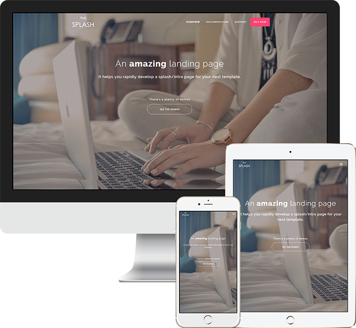
Your template works on any device: desktop, tablet or mobile. It'll adjust the size and position of components based on the screen size of user.
Clean code
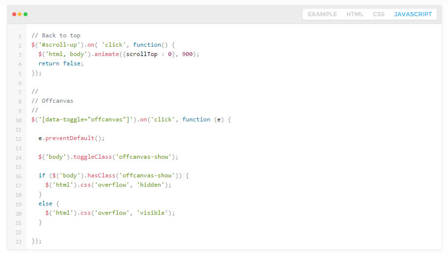
You can find our code well organized, commented and readable. It uses minimal coding to reduce the size of template. Apart from that, you've access to SCSS and Grunt files to make your desire changes easily.
Well documented
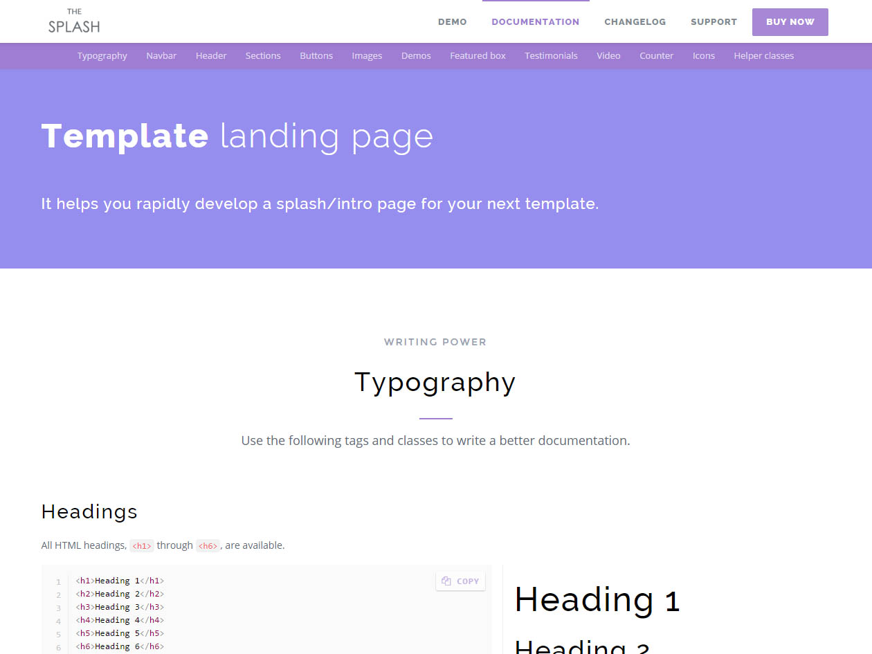
As you can see in the online documentation, we provided a comprehensive documentation. It comes with very detailed docs and includes options, features and descriptions with images. This documentation has developed by TheGuide.
Lot's of components
You're empowered by a bunch of components to help you develop much more faster.
-

Customizable header
Donec efficitur mi a velit tincidunt, sit amet accumsan nibh congue. Aliquam convallis molestie ligula.
-

Demo images
Donec efficitur mi a velit tincidunt, sit amet accumsan nibh congue. Aliquam convallis molestie ligula.
-

Demo category
Donec efficitur mi a velit tincidunt, sit amet accumsan nibh congue. Aliquam convallis molestie ligula.
-

Feature box
Donec efficitur mi a velit tincidunt, sit amet accumsan nibh congue. Aliquam convallis molestie ligula.
-

Testimonials
Donec efficitur mi a velit tincidunt, sit amet accumsan nibh congue. Aliquam convallis molestie ligula.
-

Video introduction
Donec efficitur mi a velit tincidunt, sit amet accumsan nibh congue. Aliquam convallis molestie ligula.
-

Stat counter
Donec efficitur mi a velit tincidunt, sit amet accumsan nibh congue. Aliquam convallis molestie ligula.
-

Skinable
Donec efficitur mi a velit tincidunt, sit amet accumsan nibh congue. Aliquam convallis molestie ligula.
User reviews
Read why our customers recommend our design.


