Header
It contains site navigation, logo, and banner
Basic style
Following code snippet demonstrates .site-header of the current page. As you can see, it's easy to grasp the code.
<!-- Site header -->
<header class="site-header">

  <!-- Logo & Navigation -->
  <nav class="site-navigation">
    <div class="container">
      <div class="logo">
        <a class="logo-default" href="index.html"><img src="assets/img/logo.png" alt="logo"></a>
        <a class="logo-transparent" href="index.html"><img src="assets/img/logo-alt.png" alt="logo"></a>
      </div>

      <a class="navbar-toggle" href="#" data-toggle="offcanvas"><i class="fa fa-bars"></i></a>

      <ul class="nav-menu">
        <li><a href="#">Overview</a></li>
        <li><a href="#">Getting Started</a></li>
        <li><a href="#">CSS</a></li>
        <li><a class="active" href="#">Components</a></li>
        <li>
          <a href="#">Pages</a>
          <ul>
            <li><a href="#">Submenu 1</a></li>
            <li><a href="#">Submenu 2</a></li>
            <li><a href="#">Submenu 3</a></li>
            <li><a href="#">Submenu 4</a></li>
          </ul>
        </li>
        <li><a class="menu-highlighted" href="#">Buy Now</a></li>
      </ul>
    </div>
  </nav>
  <!-- END Logo & Navigation -->

  <!-- Header image -->
  <div class="header-image bg-purple no-overly no-padding">
    <div class="container">
      <br><br>
      <h1><strong>Components,</strong> Rapid development</h1>
      <h4>Over a dozen reusable components built to provide navigation, code view, content view, file tree, callouts, and much more.</h4>
      <br><br>
    </div>
  </div>
  <!-- END Header image -->
Navigation
Here, we describe some of modifier classes on navigation menu.
Full width & boxed size
The .site-navigation > div tag is responsible for sizing. It would be boxed-size if it has .container class, and will become full size by having .container-fluid.
Sticky & transparent
The body tag is responsible for changing this two property. To have a sticky navigation bar in top of the page, add .sticky-nav to the body tag. If you have a banner in your header and would like to put your navigation above it before scrolling, add .transparent-nav to the body tag.
Banner
You can see different types of banner across this documentation. You'd be able to have an image backgrounded banner or just a solid color background. Setting background is like how you can add them in sections.
By default, .header-image has a pale black overly to make contrast between texts on the image. You can simply ignore it by adding .no-overlay class to the .header-image tag. It would be better to remove overly on solid color background banners. Also, make sure to use .text-left, .text-center, .text-right, <br>, etc. for alignment and spacing.
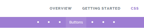
Page navigation
Provide an in-page navigation for user to access each section easily
Basic style
Following code snippet demonstrates .page-navigation of the css.html page. As you can see, it's easy to grasp the code. You just need to put section's ID inside href of an <a> tag.
<!-- Navigation -->
<nav class="page-navigation full-topbar">
  <ul class="nav">
    <li><a href="#sec-typography">Typography</a></li>
    <li><a href="#sec-sections">Sections</a></li>
    <li><a href="#sec-tables">Tables</a></li>
    <li><a href="#sec-buttons">Buttons</a></li>
    <li><a href="#sec-labels">Labels</a></li>
    <li><a href="#sec-images">Images</a></li>
    <li><a href="#sec-helper">Helper classes</a></li>
  </ul>
</nav>
<!-- END Navigation -->
Variations
You have two different layout for .page-navigation; .full-topbar which shows all the links title like this page, and .dotted-topbar which shows a dot instead of the link text to save some space. The dotted version would be nice for navigations with a large number of links. In small devices, we automatically use dotted version.
Code view
You have a plenty of options to demonstrate your code and result in your documentation
Simple code blocks
Here is basic usage of tags like code, pre, kbd, var and samp.
Inline
Wrap inline snippets of code with <code>.
<section> should be wrapped as inline.
For example, <code><section></code> should be wrapped as inline.Basic block
Use <pre> for multiple lines of code. Be sure to escape any angle brackets in the code for proper rendering.
Sample text here...
<pre>Sample text here...</pre>You may optionally add the .pre-scrollable class, which will set a max-height of 350px and provide a y-axis scrollbar.
User input
Use the <kbd> to indicate input that is typically entered via keyboard.
To edit settings, press ctrl + ,
To switch directories, type <kbd>cd</kbd> followed by the name of the directory.<br>
To edit settings, press <kbd><kbd>ctrl</kbd> + <kbd>,</kbd></kbd>
Variables
For indicating variables use the <var> tag.
<var>y</var> = <var>m</var><var>x</var> + <var>b</var>Sample output
For indicating blocks sample output from a program use the <samp> tag.
<samp>This text is meant to be treated as sample output from a computer program.</samp>Syntax highlighter
theDocs uses PrismJs for syntax highlighting code snippets. You have to put your code inside <pre><code class="language-xxxx"> which xxxx is the name of language.
<p>Something to show in <strong>bold</strong> text.</p>
...
<i>Italic text</i>
If you need to include line numbers, add class .line-numbers to the <pre> tag.
<p>Something to show in <strong>bold</strong> text.</p>
...
<i>Italic text</i>
Simple code view
Just add .simple-view class to the <pre> tag to have a code view like below one.
<p>Something to show in <strong>bold</strong> text.</p>
...
<i>Italic text</i>
Supported languages
This is the list of all languages currently supported by Prism, with their corresponding alias, to use in place of xxxx in the language-xxxx class:
- HTML/XML
markup - CSS
css - C-like
clike - JavaScript
javascript - ASP.NET (C#)
aspnet - Bash
bash - C
c - C#
csharp - C++
cpp - CoffeeScript
coffeescript - Git
git - HTTP
http - Ini
ini - Java
java - LaTeX
latex - Less
less - MATLAB
matlab - Objective-C
objectivec - Perl
perl - PHP
php - Python
python - Ruby
ruby - Sass (Scss)
scss - SQL
sql - Swift
swift
Code wrappers
If your code snippet includes several languages or a preview of result, it's better to use one of the following code wrappers.
Code window
Wrap your code and preview inside <div class="code-window">...</div> to show them in a window style with different tabs. In this way, reader can see one code snippet in a same time.
This is a normal paragraph without any contextual classes.
A paragraph with .text-primary class.
A paragraph with .text-success class.
A paragraph with .text-info class.
A paragraph with .text-warning class.
A paragraph with .text-danger class.
A paragraph with .text-gray class.
A paragraph with .text-dark class.
<p>This is a normal paragraph without any contextual classes.</p>
<p class="text-primary">A paragraph with .text-primary class.</p>
<p class="text-success">A paragraph with .text-success class.</p>
<p class="text-info">A paragraph with .text-info class.</p>
<p class="text-warning">A paragraph with .text-warning class.</p>
<p class="text-danger">A paragraph with .text-danger class.</p>
<p class="text-gray">A paragraph with .text-gray class.</p>
<p class="text-dark">A paragraph with .text-dark class.</p>
.text-primary { color: #2196F3; }
.text-success { color: #4CAF50; }
.text-info    { color: #29B6F6; }
.text-warning { color: #FF9800; }
.text-danger  { color: #F44336; }
.text-purple  { color: #6D5CAE; }
.text-teal    { color: #00BFA5; }
.text-gray    { color: #bbbbbb; }
.text-dark    { color: #424242; }
.text-white   { color: #ffffff; }
$('.sidenav.dropable > li > a').click(function(e){
  if ( 0 == $(this).next("ul").size() || 0 == $(this).next("ul:hidden").size() ) {
      return;
  }
  e.preventDefault();
  $(this).parents(".sidenav").find("ul").not(":hidden").slideUp(300);
  $(this).next("ul").slideDown(300);
});
Here is the code which we used to draw above code window:
<div class="code-window">
  <div class="code-preview">...</div>
  <pre class="line-numbers"><code class="language-markup">...</code></pre>
  <pre class="line-numbers"><code class="language-css">...</code></pre>
  <pre class="line-numbers"><code class="language-javascript">...</code></pre>
</div>
Code splitted
Wrap your code and preview inside <div class="code-splitted">...</div> to show them horizontally in two side.
<p>This is a normal paragraph without any contextual classes.</p>
<p class="text-primary">A paragraph with .text-primary class.</p>
<p class="text-success">A paragraph with .text-success class.</p>
<p class="text-info">A paragraph with .text-info class.</p>
<p class="text-warning">A paragraph with .text-warning class.</p>
<p class="text-danger">A paragraph with .text-danger class.</p>
<p class="text-gray">A paragraph with .text-gray class.</p>
<p class="text-dark">A paragraph with .text-dark class.</p>
.text-primary { color: #2196F3; }
.text-success { color: #4CAF50; }
.text-info    { color: #29B6F6; }
.text-warning { color: #FF9800; }
.text-danger  { color: #F44336; }
.text-purple  { color: #6D5CAE; }
.text-teal    { color: #00BFA5; }
.text-gray    { color: #bbbbbb; }
.text-dark    { color: #424242; }
.text-white   { color: #ffffff; }
$('.sidenav.dropable > li > a').click(function(e){
  if ( 0 == $(this).next("ul").size() || 0 == $(this).next("ul:hidden").size() ) {
      return;
  }
  e.preventDefault();
  $(this).parents(".sidenav").find("ul").not(":hidden").slideUp(300);
  $(this).next("ul").slideDown(300);
});
This is a normal paragraph without any contextual classes.
A paragraph with .text-primary class.
A paragraph with .text-success class.
A paragraph with .text-info class.
A paragraph with .text-warning class.
A paragraph with .text-danger class.
A paragraph with .text-gray class.
A paragraph with .text-dark class.
Here is the code which we used to draw above code splitted:
<div class="code-splitted">

  <div class="code-group col-md-7">
    <pre class="line-numbers"><code class="language-markup">...</code></pre>
    <pre class="line-numbers"><code class="language-css">...</code></pre>
    <pre class="line-numbers"><code class="language-javascript">...</code></pre>
  </div>

  <div class="code-preview col-md-5">
    ...
  </div>

</div>
Code snippet
Wrap your code and preview inside <div class="code-snippet">...</div> to show them in a vertical style. Use this style to show all of the codes in a same view.
This is a normal paragraph without any contextual classes.
A paragraph with .text-primary class.
A paragraph with .text-success class.
A paragraph with .text-info class.
A paragraph with .text-warning class.
A paragraph with .text-danger class.
A paragraph with .text-gray class.
A paragraph with .text-dark class.
<p>This is a normal paragraph without any contextual classes.</p>
<p class="text-primary">A paragraph with .text-primary class.</p>
<p class="text-success">A paragraph with .text-success class.</p>
<p class="text-info">A paragraph with .text-info class.</p>
<p class="text-warning">A paragraph with .text-warning class.</p>
<p class="text-danger">A paragraph with .text-danger class.</p>
<p class="text-gray">A paragraph with .text-gray class.</p>
<p class="text-dark">A paragraph with .text-dark class.</p>
.text-primary { color: #2196F3; }
.text-success { color: #4CAF50; }
.text-info    { color: #29B6F6; }
.text-warning { color: #FF9800; }
.text-danger  { color: #F44336; }
.text-purple  { color: #6D5CAE; }
.text-teal    { color: #00BFA5; }
.text-gray    { color: #bbbbbb; }
.text-dark    { color: #424242; }
.text-white   { color: #ffffff; }
$('.sidenav.dropable > li > a').click(function(e){
  if ( 0 == $(this).next("ul").size() || 0 == $(this).next("ul:hidden").size() ) {
      return;
  }
  e.preventDefault();
  $(this).parents(".sidenav").find("ul").not(":hidden").slideUp(300);
  $(this).next("ul").slideDown(300);
});
Here is the code which we used to draw above code snippet:
<div class="code-snippet">
  <div class="code-preview">...</div>
  <pre class="line-numbers"><code class="language-markup">...</code></pre>
  <pre class="line-numbers"><code class="language-css">...</code></pre>
  <pre class="line-numbers"><code class="language-javascript">...</code></pre>
</div>
Helper classes
Each <pre> tag would accept two modifier class:
.no-copy: Remove copy button.no-name: Remove language name which is located beside copy button
Content view
Categorize your links and contents inside a decent content view
Views are another way to display several related information together. Mostly you can use them to list the articles which is available in your documentation. Choose the layout that suits the type of content you’re displaying.
Link list
In this view, you can categorize your articles or tutorials in several part and show more content in fewer space.
-
Getting started
New To theDocs - Where to Start theDocs in Your Language Lessons Tutorials Frequently Asked Questions -
Learn How to Use
Creating a starter page Creat your header Creat a footer Add links to sidebar -
Working With Themes
Theme Development Design and Layout Color cariations -
Write a Plugin
Writing a Plugin Plugin API Plugin Resources -
Contribute to Development
Developer Documentation Reporting Bugs Development Blog FAQ Developer Documentation
<ul class="link-list">
  <li>
    <h5>Getting started</h5>
    <a href="#">New To theDocs - Where to Start</a>
    <a href="#">theDocs in Your Language</a>
    <a href="#">Lessons</a>
    <a href="#">Tutorials</a>
    <a href="#">Frequently Asked Questions</a>
  </li>

  <li>
    <h5>Learn How to Use</h5>
    <a href="#">Creating a starter page</a>
    <a href="#">Creat your header</a>
    <a href="#">Creat a footer</a>
    <a href="#">Add links to sidebar</a>
  </li>

  <li>
    <h5>Working With Themes</h5>
    <a href="#">Theme Development</a>
    <a href="#">Design and Layout</a>
    <a href="#">Color cariations</a>
  </li>

  <li>
    <h5>Write a Plugin</h5>
    <a href="#">Writing a Plugin</a>
    <a href="#">Plugin API</a>
    <a href="#">Plugin Resources</a>
  </li>

  <li>
    <h5>Contribute to Development</h5>
    <a href="#">Developer Documentation</a>
    <a href="#">Reporting Bugs</a>
    <a href="#">Development Blog</a>
    <a href="#">FAQ Developer Documentation</a>
  </li>
</ul>
Three column
You have size modifiers to use with .link-lists. They are .cols-1, .cols-2, and .cols-4 which modifies default columns number that is three.
List view
In this way, you can show meta data below the title, and write some description of the article before viewing it.
-
Get Going Fast
A quick-start guide to all the basics you need to get up and running now. Vestibulum lacinia nibh vel porttitor lacinia. Praesent ante nunc, auctor mattis luctus quis, condimentum sed tellus.
-
Get a Homepage
Learn how to turn that blog into a static website for your business or your organization. Vestibulum lacinia nibh vel porttitor lacinia. Praesent ante nunc, auctor mattis luctus quis, condimentum sed tellus.
-
Get Lingo
Lorem ipsum dolor sit amet, consectetur adipiscing elit. Donec quis bibendum ligula. Vestibulum lacinia nibh vel porttitor lacinia. Praesent ante nunc, auctor mattis luctus quis, condimentum sed tellus.
<ul class="list-view">
  <li>
    <h5><a href="#">Get Going Fast</a></h5>
    <p class="meta-data">August 19, 2015 | 3 mins | Beginner</p>
    <p>A quick-start guide to all the basics you need to get up and running now. Vestibulum lacinia nibh vel porttitor lacinia. Praesent ante nunc, auctor mattis luctus quis, condimentum sed tellus.</p>
  </li>

  <li>
    <h5><a href="#">Get a Homepage</a></h5>
    <p class="meta-data">August 26, 2015 | 5 mins | Beginner</p>
    <p>Learn how to turn that blog into a static website for your business or your organization. Vestibulum lacinia nibh vel porttitor lacinia. Praesent ante nunc, auctor mattis luctus quis, condimentum sed tellus.</p>
  </li>

  <li>
    <h5><a href="#">Get Lingo</a></h5>
    <p class="meta-data">September 05, 2015 | 12 mins | Intermediate</p>
    <p>Lorem ipsum dolor sit amet, consectetur adipiscing elit. Donec quis bibendum ligula. Vestibulum lacinia nibh vel porttitor lacinia. Praesent ante nunc, auctor mattis luctus quis, condimentum sed tellus.</p>
  </li>
</ul>
You can remove border bottom by applying .no-border-bottom class to the .list-view.
List view item
You can use list view style with default bootstrap grid system.
Get Going Fast
A quick-start guide to all the basics you need to get up and running now. Vestibulum lacinia nibh vel porttitor lacinia. Praesent ante nunc, auctor mattis luctus quis, condimentum sed tellus.
Get a Homepage
Learn how to turn that blog into a static website for your business or your organization. Vestibulum lacinia nibh vel porttitor lacinia. Praesent ante nunc, auctor mattis luctus quis, condimentum sed tellus.
Get Lingo
Lorem ipsum dolor sit amet, consectetur adipiscing elit. Donec quis bibendum ligula. Vestibulum lacinia nibh vel porttitor lacinia. Praesent ante nunc, auctor mattis luctus quis, condimentum sed tellus.
<div class="row">
  <div class="col-md-4 list-view-item">
    <h5><a href="#">Get Going Fast</a></h5>
    <p class="meta-data">August 19, 2015 | 3 mins | Beginner</p>
    <p>A quick-start guide to all the basics you need to get up and running now. Vestibulum lacinia nibh vel porttitor lacinia. Praesent ante nunc, auctor mattis luctus quis, condimentum sed tellus.</p>
  </div>

  <div class="col-md-4 list-view-item">
    <h5><a href="#">Get a Homepage</a></h5>
    <p class="meta-data">August 26, 2015 | 5 mins | Beginner</p>
    <p>Learn how to turn that blog into a static website for your business or your organization. Vestibulum lacinia nibh vel porttitor lacinia. Praesent ante nunc, auctor mattis luctus quis, condimentum sed tellus.</p>
  </div>

  <div class="col-md-4 list-view-item">
    <h5><a href="#">Get Lingo</a></h5>
    <p class="meta-data">September 05, 2015 | 12 mins | Intermediate</p>
    <p>Lorem ipsum dolor sit amet, consectetur adipiscing elit. Donec quis bibendum ligula. Vestibulum lacinia nibh vel porttitor lacinia. Praesent ante nunc, auctor mattis luctus quis, condimentum sed tellus.</p>
  </div>
</div>
Also, you can modify appearance of item by adding category and continue reading link.
<div class="list-view-item">
  <span>Design</span>
  <h5>Get a Homepage</h5>
  <p class="meta-data">August 26, 2015 | 5 mins | Beginner</p>
  <p>Learn how to...</p>
  <a class="read-more" href="#">Continue reading...</a>
</div>
Get a Homepage
Learn how to turn that blog into a static website for your business or your organization. Vestibulum lacinia nibh vel porttitor lacinia. Praesent ante nunc, auctor mattis luctus quis, condimentum sed tellus.
Continue reading...Steps
Prepare a chronological guide to perform an action in your product
Text style
The simplest way to make a step.
-
Place your cursor
A gallery can go anywhere on a page or post - by itself on a blank page, or above, below, or in the midst of text. Start by placing your cursor where you want the gallery to appear.
-
Click the Add Media button
Once you've placed your cursor where you want your image gallery to appear, click on the Add Media button (located left above the editing window) to launch the media uploader interface. In the resulting popup window, select the 'Create a Gallery' option from the list of actions on the left.
-
Add and/or Select the Images
You can add or select the images you want to include in your image gallery by choosing from either of the following options in the center of the media uploader window.
-
Edit Your Gallery
On the Edit Gallery page, you can do the following things before inserting the gallery you have created into your page or post.
<h3>Adding a gallary to Wordpress</h3>
<ul class="step-text">
  <li>
    <h5>Place your cursor</h5>
    <p>A gallery can go anywhere on a page or post - by itself on a blank page, or above, below, or in the midst of text. Start by placing your cursor where you want the gallery to appear.</p>
  </li>

  <li>
    <h5>Click the Add Media button</h5>
    <p>...</p>
  </li>

  <li>
    <h5>Add and/or Select the Images</h5>
    <p>...</p>
  </li>

  <li>
    <h5>Edit Your Gallery</h5>
    <p>...</p>
  </li>
</ul>
Also, you can add .step-cols-2 or .step-cols-3 to the .step-text to change number of rows.
Image style
If you have a picture for every step, we suggest you to use this step as it's more interactive.
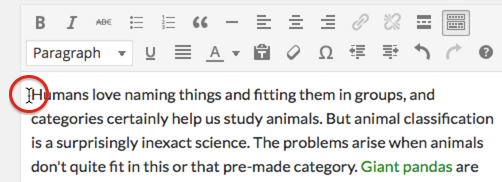
Placing your cursor
In order to add an image to your page or post, you must first insert your cursor in the place in the text where you want the image to appear. By placing your cursor within your text, you can add images inline with your content. You can also place your cursor on a blank line if you want the image to appear by itself instead.
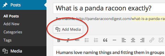
Click the Add Media button
Once you’ve placed your cursor on the line where you want your image to appear, click on the Add Media button to launch the media uploader interface, and then select the Insert Media option from the list of actions in the left side of the media uploader window.
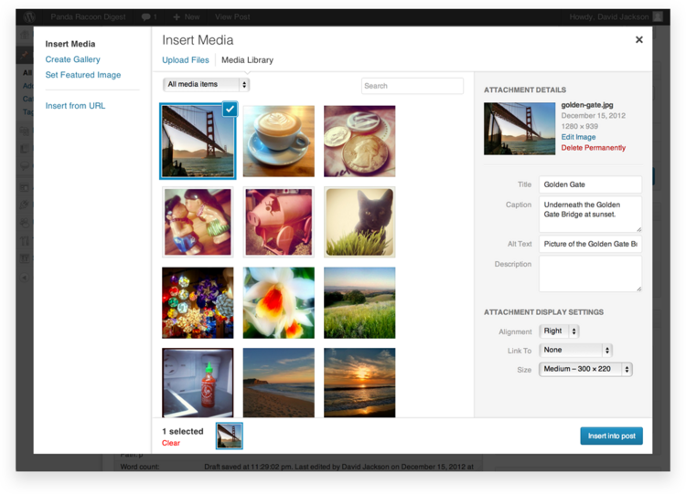
Add or Select Your Image
You can add or select the image you want to add to your page or post by choosing from either of the following options in the center of the media uploader window:
- Upload Files: Upload the image you want to use from your computer by dragging it into the upload area.
- Media Library: Select from any previously uploaded images in the media library by clicking on the one you wish to add to your page or post.
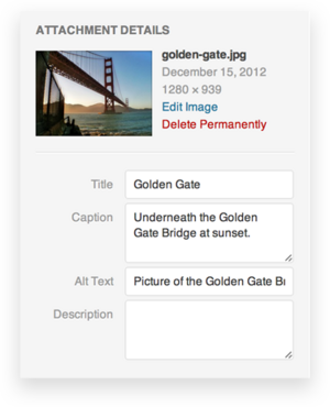
Attachment Details
The Attachment Details pane displays a small un-cropped thumbnail of the image, as well as important information such as the filename, date uploaded, and image dimensions in pixels.
<div id="step-image" class="step-image carousel slide">
  <!-- Indicators -->
  <ol class="carousel-indicators">
    <li data-target="#step-image" data-slide-to="0" class="active"></li>
    <li data-target="#step-image" data-slide-to="1"></li>
    <li data-target="#step-image" data-slide-to="2"></li>
    <li data-target="#step-image" data-slide-to="3"></li>
  </ol>

  <!-- Wrapper for slides -->
  <div class="carousel-inner" role="listbox">
    <div class="item active">
      <img src="assets/img/step1.png" alt="">
      <div class="carousel-caption">
        <h4>Placing your cursor</h4>
        <p>In order to add an image to your page or post, you must first insert your cursor in the place in the text where you want the image to appear. By placing your cursor within your text, you can add images inline with your content. You can also place your cursor on a blank line if you want the image to appear by itself instead.</p>
      </div>
    </div>

    <div class="item">
      <img src="assets/img/step2.png" alt="">
      <div class="carousel-caption">
        <h4>Click the Add Media button</h4>
        <p>...</p>
      </div>
    </div>

    <div class="item">
      <img src="assets/img/step3.png" alt="">
      <div class="carousel-caption">
        <h4>Add or Select Your Image</h4>
        <div>...</div>
      </div>
    </div>

    <div class="item">
      <img src="assets/img/step4.png" alt="">
      <div class="carousel-caption">
        <h4>Attachment Details</h4>
        <p>...</p>
      </div>
    </div>

  </div>

  <!-- Controls -->
  <a class="left carousel-control" href="#step-image" role="button" data-slide="prev">
    <i class="fa fa-angle-left"></i>
  </a>
  <a class="right carousel-control" href="#step-image" role="button" data-slide="next">
    <i class="fa fa-angle-right"></i>
  </a>
</div>
Featured box
Present key features of your product in overview page
Iconic
Here's some examples that uses icon in feature boxes.
Default
-
Responsive
Donec efficitur mi a velit tincidunt, sit amet accumsan nibh congue. Aliquam convallis molestie ligula.
-
Customizable
Donec efficitur mi a velit tincidunt, sit amet accumsan nibh congue. Aliquam convallis molestie ligula.
-
Full of features
Donec efficitur mi a velit tincidunt, sit amet accumsan nibh congue. Aliquam convallis molestie ligula.
<ul class="features">
  <li>
    <div class="icon"><i class="fa fa-mobile"></i></div>
    <h5>Responsive</h5>
    <p>Donec efficitur mi a velit tincidunt, sit amet accumsan nibh congue. Aliquam convallis molestie ligula.</p>
  </li>

  <li>
    <div class="icon"><i class="fa fa-cog"></i></div>
    <h5>Customizable</h5>
    <p>Donec efficitur mi a velit tincidunt, sit amet accumsan nibh congue. Aliquam convallis molestie ligula.</p>
  </li>

  <li>
    <div class="icon"><i class="fa fa-code"></i></div>
    <h5>Full of features</h5>
    <p>Donec efficitur mi a velit tincidunt, sit amet accumsan nibh congue. Aliquam convallis molestie ligula.</p>
  </li>
</ul>
Round
Adding .icon-round to the .features tag.
-
Responsive
Donec efficitur mi a velit tincidunt, sit amet accumsan nibh congue. Aliquam convallis molestie ligula.
-
Customizable
Donec efficitur mi a velit tincidunt, sit amet accumsan nibh congue. Aliquam convallis molestie ligula.
-
Full of features
Donec efficitur mi a velit tincidunt, sit amet accumsan nibh congue. Aliquam convallis molestie ligula.
<ul class="features icon-round">
  <li>
    <div class="icon"><i class="fa fa-mobile"></i></div>
    <h5>Responsive</h5>
    <p>Donec efficitur mi a velit tincidunt, sit amet accumsan nibh congue. Aliquam convallis molestie ligula.</p>
  </li>

  <li>
    <div class="icon"><i class="fa fa-cog"></i></div>
    <h5>Customizable</h5>
    <p>Donec efficitur mi a velit tincidunt, sit amet accumsan nibh congue. Aliquam convallis molestie ligula.</p>
  </li>

  <li>
    <div class="icon"><i class="fa fa-code"></i></div>
    <h5>Full of features</h5>
    <p>Donec efficitur mi a velit tincidunt, sit amet accumsan nibh congue. Aliquam convallis molestie ligula.</p>
  </li>
</ul>
Sided
Adding .icon-sided to the .features tag.
-
Responsive
Donec efficitur mi a velit tincidunt, sit amet accumsan nibh congue. Aliquam convallis molestie ligula.
-
Customizable
Donec efficitur mi a velit tincidunt, sit amet accumsan nibh congue. Aliquam convallis molestie ligula.
-
Full of features
Donec efficitur mi a velit tincidunt, sit amet accumsan nibh congue. Aliquam convallis molestie ligula.
<ul class="features icon-sided">
  <li>
    <div class="icon"><i class="fa fa-mobile"></i></div>
    <h5>Responsive</h5>
    <p>Donec efficitur mi a velit tincidunt, sit amet accumsan nibh congue. Aliquam convallis molestie ligula.</p>
  </li>

  <li>
    <div class="icon"><i class="fa fa-cog"></i></div>
    <h5>Customizable</h5>
    <p>Donec efficitur mi a velit tincidunt, sit amet accumsan nibh congue. Aliquam convallis molestie ligula.</p>
  </li>

  <li>
    <div class="icon"><i class="fa fa-code"></i></div>
    <h5>Full of features</h5>
    <p>Donec efficitur mi a velit tincidunt, sit amet accumsan nibh congue. Aliquam convallis molestie ligula.</p>
  </li>
</ul>
Change color
You can easily change fore-color or background-color of icons using .txt-* and .bg-* classes which described in typography section.
Image
It's possible to use an image instead of icons. You need to add .icon-image class. Check samples.
-

Responsive
Donec efficitur mi a velit tincidunt, sit amet accumsan nibh congue. Aliquam convallis molestie ligula.
-
Customizable
Donec efficitur mi a velit tincidunt, sit amet accumsan nibh congue. Aliquam convallis molestie ligula.
-
Full of features
Donec efficitur mi a velit tincidunt, sit amet accumsan nibh congue. Aliquam convallis molestie ligula.
<ul class="features icon-image">
  <li>
    <div class="icon"><img src="assets/img/placeholder.png" alt="placeholder"></div>
    <h5>Responsive</h5>
    <p>Donec efficitur mi a velit tincidunt, sit amet accumsan nibh congue. Aliquam convallis molestie ligula.</p>
  </li>

  <li>
    <div class="icon"><img src="assets/img/placeholder.png" alt="placeholder"></div>
    <h5>Customizable</h5>
    <p>Donec efficitur mi a velit tincidunt, sit amet accumsan nibh congue. Aliquam convallis molestie ligula.</p>
  </li>

  <li>
    <div class="icon"><img src="assets/img/placeholder.png" alt="placeholder"></div>
    <h5>Full of features</h5>
    <p>Donec efficitur mi a velit tincidunt, sit amet accumsan nibh congue. Aliquam convallis molestie ligula.</p>
  </li>
</ul>
With border
-
Responsive
Donec efficitur mi a velit tincidunt, sit amet accumsan nibh congue. Aliquam convallis molestie ligula.
-
Customizable
Donec efficitur mi a velit tincidunt, sit amet accumsan nibh congue. Aliquam convallis molestie ligula.
-
Full of features
Donec efficitur mi a velit tincidunt, sit amet accumsan nibh congue. Aliquam convallis molestie ligula.
<ul class="features icon-image">
  <li>
    <div class="icon"><img class="img-thumbnail" src="assets/img/placeholder.png" alt="placeholder"></div>
    <h5>Responsive</h5>
    <p>Donec efficitur mi a velit tincidunt, sit amet accumsan nibh congue. Aliquam convallis molestie ligula.</p>
  </li>

  <li>
    <div class="icon"><img class="img-thumbnail" src="assets/img/placeholder.png" alt="placeholder"></div>
    <h5>Customizable</h5>
    <p>Donec efficitur mi a velit tincidunt, sit amet accumsan nibh congue. Aliquam convallis molestie ligula.</p>
  </li>

  <li>
    <div class="icon"><img class="img-thumbnail" src="assets/img/placeholder.png" alt="placeholder"></div>
    <h5>Full of features</h5>
    <p>Donec efficitur mi a velit tincidunt, sit amet accumsan nibh congue. Aliquam convallis molestie ligula.</p>
  </li>
</ul>
Action button
You may need to use a button with a feature.
-
Responsive
Donec efficitur mi a velit tincidunt, sit amet accumsan nibh congue. Aliquam convallis molestie ligula.
Learn more -
Customizable
Donec efficitur mi a velit tincidunt, sit amet accumsan nibh congue. Aliquam convallis molestie ligula.
Learn more -
Full of features
Donec efficitur mi a velit tincidunt, sit amet accumsan nibh congue. Aliquam convallis molestie ligula.
Learn more
<ul class="features">
  <li>
    <h5>Responsive</h5>
    <p>Donec efficitur mi a velit tincidunt, sit amet accumsan nibh congue. Aliquam convallis molestie ligula.</p>
    <a class="btn" href="#">Learn more</a>
  </li>

  <li>
    <h5>Customizable</h5>
    <p>Donec efficitur mi a velit tincidunt, sit amet accumsan nibh congue. Aliquam convallis molestie ligula.</p>
    <a class="btn" href="#">Learn more</a>
  </li>

  <li>
    <h5>Full of features</h5>
    <p>Donec efficitur mi a velit tincidunt, sit amet accumsan nibh congue. Aliquam convallis molestie ligula.</p>
    <a class="btn" href="#">Learn more</a>
  </li>
</ul>
-
Responsive
Donec efficitur mi a velit tincidunt, sit amet accumsan nibh congue. Aliquam convallis molestie ligula.
Learn more -
Customizable
Donec efficitur mi a velit tincidunt, sit amet accumsan nibh congue. Aliquam convallis molestie ligula.
Learn more -
Full of features
Donec efficitur mi a velit tincidunt, sit amet accumsan nibh congue. Aliquam convallis molestie ligula.
Learn more
<ul class="features icon-image">
  <li>
    <div class="icon"><img class="img-thumbnail" src="assets/img/placeholder.png" alt="placeholder"></div>
    <h5>Responsive</h5>
    <p>Donec efficitur mi a velit tincidunt, sit amet accumsan nibh congue. Aliquam convallis molestie ligula.</p>
    <a class="btn" href="#">Learn more</a>
  </li>

  <li>
    <div class="icon"><img class="img-thumbnail" src="assets/img/placeholder.png" alt="placeholder"></div>
    <h5>Customizable</h5>
    <p>Donec efficitur mi a velit tincidunt, sit amet accumsan nibh congue. Aliquam convallis molestie ligula.</p>
    <a class="btn" href="#">Learn more</a>
  </li>

  <li>
    <div class="icon"><img class="img-thumbnail" src="assets/img/placeholder.png" alt="placeholder"></div>
    <h5>Full of features</h5>
    <p>Donec efficitur mi a velit tincidunt, sit amet accumsan nibh congue. Aliquam convallis molestie ligula.</p>
    <a class="btn" href="#">Learn more</a>
  </li>
</ul>
Column number
You can change number of columns by adding either .cols-1 or .cols-2 to the .features tag.
Tabs
Add quick, dynamic tab functionality to transition through panes of local content
Text tabs
The simplest way to create a tab element.
But I must explain to you how all this mistaken idea of denouncing pleasure and praising pain was born and I will give you a complete account of the system, and expound the actual teachings of the great explorer of the truth, the master-builder of human happiness.
No one rejects, dislikes, or avoids pleasure itself, because it is pleasure, but because those who do not know how to pursue pleasure rationally encounter consequences that are extremely painful.
Nor again is there anyone who loves or pursues or desires to obtain pain of itself, because it is pain, but because occasionally circumstances occur in which toil and pain can procure him some great pleasure. To take a trivial example, which of us ever undertakes laborious physical exercise, except to obtain some advantage from it?
On the other hand, we denounce with righteous indignation and dislike men who are so beguiled and demoralized by the charms of pleasure of the moment, so blinded by desire, that they cannot foresee the pain and trouble that are bound to ensue; and equal blame belongs to those who fail in their duty through weakness of will, which is the same as saying through shrinking from toil and pain. These cases are perfectly simple and easy to distinguish.
<div class="tabs tabs-text">

  <!-- Nav tabs -->
  <ul class="nav nav-tabs" role="tablist">
    <li role="presentation" class="active">
      <a href="#home1" aria-controls="home1" role="tab" data-toggle="tab">Home</a>
    </li>
    <li role="presentation">
      <a href="#profile1" aria-controls="profile1" role="tab" data-toggle="tab">Profile</a>
    </li>
    <li role="presentation">
      <a href="#messages1" aria-controls="messages1" role="tab" data-toggle="tab">Messages</a>
    </li>
    <li role="presentation">
      <a href="#settings1" aria-controls="settings1" role="tab" data-toggle="tab"><i class="fa fa-cogs"></i> Settings</a>
    </li>
  </ul>

  <!-- Tab panes -->
  <div class="tab-content">
    <div role="tabpanel" class="tab-pane active fade in" id="home1">...</div>
    <div role="tabpanel" class="tab-pane fade" id="profile1">...</div>
    <div role="tabpanel" class="tab-pane fade" id="messages1">...</div>
    <div role="tabpanel" class="tab-pane fade" id="settings1">...</div>
  </div>

</div>
Alignment
Add .text-center or .text-right to the ul.nav to change the position of tabs.
But I must explain to you how all this mistaken idea of denouncing pleasure and praising pain was born and I will give you a complete account of the system, and expound the actual teachings of the great explorer of the truth, the master-builder of human happiness.
No one rejects, dislikes, or avoids pleasure itself, because it is pleasure, but because those who do not know how to pursue pleasure rationally encounter consequences that are extremely painful.
Nor again is there anyone who loves or pursues or desires to obtain pain of itself, because it is pain, but because occasionally circumstances occur in which toil and pain can procure him some great pleasure. To take a trivial example, which of us ever undertakes laborious physical exercise, except to obtain some advantage from it?
On the other hand, we denounce with righteous indignation and dislike men who are so beguiled and demoralized by the charms of pleasure of the moment, so blinded by desire, that they cannot foresee the pain and trouble that are bound to ensue; and equal blame belongs to those who fail in their duty through weakness of will, which is the same as saying through shrinking from toil and pain. These cases are perfectly simple and easy to distinguish.
<div class="tabs tabs-text">

  <!-- Nav tabs -->
  <ul class="nav nav-tabs text-right" role="tablist">
    <li role="presentation" class="active">
      <a href="#home3" aria-controls="home3" role="tab" data-toggle="tab">Home</a>
    </li>
    <li role="presentation">
      <a href="#profile3" aria-controls="profile3" role="tab" data-toggle="tab">Profile</a>
    </li>
    <li role="presentation">
      <a href="#messages3" aria-controls="messages3" role="tab" data-toggle="tab">Messages</a>
    </li>
    <li role="presentation">
      <a href="#settings3" aria-controls="settings3" role="tab" data-toggle="tab"><i class="fa fa-cogs"></i> Settings</a>
    </li>
  </ul>

  <!-- Tab panes -->
  <div class="tab-content">
    <div role="tabpanel" class="tab-pane active fade in" id="home3">...</div>
    <div role="tabpanel" class="tab-pane fade" id="profile3">...</div>
    <div role="tabpanel" class="tab-pane fade" id="messages3">...</div>
    <div role="tabpanel" class="tab-pane fade" id="settings3">...</div>
  </div>

</div>
Big icon tabs
<div class="tabs tabs-icon">

  <!-- Nav tabs -->
  <ul class="nav nav-tabs text-center" role="tablist">
    <li role="presentation" class="active">
      <a href="#home2" aria-controls="home2" role="tab" data-toggle="tab">
        <i class="fa fa-home"></i>
        <span>Home</span>
      </a>
    </li>
    <li role="presentation">
      <a href="#profile2" aria-controls="profile2" role="tab" data-toggle="tab">
        <i class="fa fa-user"></i>
        <span>Profile</span>
      </a>
    </li>
    <li role="presentation">
      <a href="#messages2" aria-controls="messages2" role="tab" data-toggle="tab">
        <i class="fa fa-comment-o"></i>
        <span>Messages</span>
      </a>
    </li>
    <li role="presentation">
      <a href="#settings2" aria-controls="settings2" role="tab" data-toggle="tab">
        <i class="fa fa-cogs"></i>
        <span>Settings</span>
      </a>
    </li>
  </ul>

  <!-- Tab panes -->
  <div class="tab-content">
    <div role="tabpanel" class="tab-pane active fade in" id="home2">...</div>
    <div role="tabpanel" class="tab-pane fade" id="profile2">...</div>
    <div role="tabpanel" class="tab-pane fade" id="messages2">...</div>
    <div role="tabpanel" class="tab-pane fade" id="settings2">...</div>
  </div>

</div>
Callout
Provide contextual feedback messages for typical user actions
Well done!
You successfully read this important alert message.
Heads up!
This alert needs your attention, but it's not super important.
Warning!
Better check yourself, you're not looking too good.
Oh snap!
Change a few things up and try submitting again.
<div class="callout callout-success" role="alert">
  <h4>Well done!</h4>
  <p>You successfully read this important alert message.</p>
</div>

<div class="callout callout-info" role="alert">
  <h4>Heads up!</h4>
  <p>This alert needs your attention, but it's not super important.</p>
</div>

<div class="callout callout-warning" role="alert">
  <h4>Warning!</h4>
  <p>Better check yourself, you're <a href="#">not looking too good</a>.</p>
</div>

<div class="callout callout-danger" role="alert">
  <h4>Oh snap!</h4>
  <p><a href="#">Change a few things up</a> and try submitting again.</p>
</div>
File tree
Provide some description for each file and folder inside your package
-
css
some description about the folder
- custom.css some description about the file
- theDocs.css some description about the file
-
fonts
some description about the folder
- fontawesome-webfont.eot some description about the file
- fontawesome-webfont.svg some description about the file
- fontawesome-webfont.ttf some description about the file
- fontawesome-webfont.woff some description about the file
-
img
some description about the folder
- placeholder.jpg some description about the file
- logo.png some description about the file
- sample-video.mp4 some description about the file
- ads.png some description about the file
-
vendors
some description about the folder
-
jQuery
some description about the file
- jquery.js some description about the file
- jquery.min.js some description about the file
-
Bootstrap
some description about the file
- css some description about the folder
- fonts some description about the folder
- js some description about the folder
- MediaElement some description about the file
- Prism some description about the file
-
jQuery
some description about the file
- index.html some description about the file
- dashboard.html some description about the file
- starter.html some description about the file
<div class="file-tree">
  <ul>
    <li class="is-folder open">
      <span>css</span>
      <i>some description about the folder</i>
      <ul>
        <li class="is-file">
          <span>custom.css</span>
          <i>some description about the file</i>
        </li>
        <li class="is-file">
          <span>theDocs.css</span>
          <i>some description about the file</i>
        </li>
      </ul>
    </li>

    <li class="is-folder">
      <span>fonts</span>
      <i>some description about the folder</i>
      <ul>
        <li class="is-file">
          <span>fontawesome-webfont.eot</span>
          <i>some description about the file</i>
        </li>
        <li class="is-file">
          <span>fontawesome-webfont.svg</span>
          <i>some description about the file</i>
        </li>
        <li class="is-file">
          <span>fontawesome-webfont.ttf</span>
          <i>some description about the file</i>
        </li>
        <li class="is-file">
          <span>fontawesome-webfont.woff</span>
          <i>some description about the file</i>
        </li>
      </ul>
    </li>

    <li class="is-folder">
      <span>img</span>
      <i>some description about the folder</i>
      <ul>
        <li class="is-file">
          <span>placeholder.jpg</span>
          <i>some description about the file</i>
        </li>
        <li class="is-file">
          <span>logo.png</span>
          <i>some description about the file</i>
        </li>
        <li class="is-file">
          <span>sample-video.mp4</span>
          <i>some description about the file</i>
        </li>
        <li class="is-file">
          <span>ads.png</span>
          <i>some description about the file</i>
        </li>
      </ul>
    </li>

    <li class="is-folder">
      <span>vendors</span>
      <i>some description about the folder</i>
      <ul>
        <li class="is-folder">
          <span>jQuery</span>
          <i>some description about the file</i>
          <ul>
            <li class="is-file">
              <span>jquery.js</span>
              <i>some description about the file</i>
            </li>
            <li class="is-file">
              <span>jquery.min.js</span>
              <i>some description about the file</i>
            </li>
          </ul>
        </li>

        <li class="is-folder">
          <span>Bootstrap</span>
          <i>some description about the file</i>
          <ul>
            <li class="is-folder">
              <span>css</span>
              <i>some description about the folder</i>
            </li>
            <li class="is-folder">
              <span>fonts</span>
              <i>some description about the folder</i>
            </li>
            <li class="is-folder">
              <span>js</span>
              <i>some description about the folder</i>
            </li>
          </ul>
        </li>

        <li class="is-folder">
          <span>MediaElement</span>
          <i>some description about the file</i>
        </li>

        <li class="is-folder">
          <span>Prism</span>
          <i>some description about the file</i>
        </li>
      </ul>
    </li>

    <li class="is-file">
      <span>index.html</span>
      <i>some description about the file</i>
    </li>
    <li class="is-file">
      <span>dashboard.html</span>
      <i>some description about the file</i>
    </li>
    <li class="is-file">
      <span>starter.html</span>
      <i>some description about the file</i>
    </li>
  </ul>
</div>
Default open folder
To make a folder expanded by default, add .open class to your desire li.is-folder tag.
Video
Adding a video to your page from any source
Youtube
Place embed code inside a .video tag.
<div class="video">
  <iframe width="560" height="315" src="https://www.youtube.com/embed/hQfNtnKm5nA" frameborder="0" allowfullscreen></iframe>
</div>
Vimeo
Place embed code inside a .video tag.
<div class="video">
  <iframe src="https://player.vimeo.com/video/127738920" width="500" height="281" frameborder="0" allowfullscreen></iframe>
</div>
Self-hosted
There're two way to show your self-hosted videos in your documentation.
Browser player
In this way you'll use default player of the browser. Don't forget to add width="100%" and height="100%" attributes in this way.
<div class="video">
  <video src="assets/img/video.mp4" width="100%" height="100%" controls></video>
</div>

<!-- OR -->

<div class="video">
  <video width="100%" height="100%" controls>
    <source src="assets/img/video.mp4" type="video/mp4">
    <source src="assets/img/video.webm" type="video/webm">
  </video>
</div>
Video-js player
You're also able to use a consistent video player skin across all browsers using videojs.
Make sure you'll include requirements before app.min.css and app.min.js.
<div class="videojs-container">
  <video class="video-js" controls preload="auto" poster="assets/img/video-poster.png" data-setup="{}">
    <source src="assets/img/video.mp4" type='video/mp4'>
    <source src="assets/img/video.webm" type='video/webm'>
  </video>
</div>
By default aspect ratio is 16-9, add .ratio-4by3 to the .videojs-container to change it.
Lightbox
Show image, video, and maps in a distraction-free way
Implementing as easy as adding a data-lity attribute to your <a> tags.
<a class="btn btn-block" href="assets/img/video-poster.png" data-lity>Image</a>
<a class="btn btn-block" href="//www.youtube.com/watch?v=hQfNtnKm5nA" data-lity>iFrame Youtube</a>
<a class="btn btn-block" href="//vimeo.com/127738920" data-lity>iFrame Vimeo</a>
<a class="btn btn-block" href="//maps.google.com/maps?q=1600+Amphitheatre+Parkway,+Mountain+View,+CA" data-lity>Google Maps</a>
Color palette
Comprise and show what colors are available for a component
Circular
By default, text color is white. You may need to change it based on your background-color and their contrast. You can use either classes or inline style to set background-colors.
<ul class="color-palette-circular">
  <li class="bg-purple">.bg-purple</li>
  <li class="bg-green">.bg-green</li>
  <li class="bg-blue">.bg-blue</li>
  <li style="background-color: #fe7c60">#fe7c60</li>
  <li style="background-color: #fe6060">#fe6060</li>
  <li style="background-color: #161b1f">#161b1f</li>
  <li class="bg-dark-light">.bg-dark-light</li>
  <li class="bg-dark-lighter">.bg-dark-lighter</li>
  <li class="bg-dark-lightest">.bg-dark-lightest</li>
  <li class="bg-gray txt-gray">.bg-gray</li>
  <li class="bg-gray-light txt-gray">.bg-gray-light</li>
  <li class="bg-gray-lighter txt-gray">.bg-gray-lighter</li>
</ul>
- .bg-purple
- .bg-green
- .bg-blue
- #fe7c60
- #fe6060
- #161b1f
- .bg-dark-light
- .bg-dark-lighter
- .bg-dark-lightest
- .bg-gray
- .bg-gray-light
- .bg-gray-lighter
Stacked
Just changing a class name!
<ul class="color-palette-stacked">
  <li style="background-color: #0D47A1">#0D47A1</li>
  <li style="background-color: #1565C0">#1565C0</li>
  <li style="background-color: #1976D2">#1976D2</li>
  <li style="background-color: #1E88E5">#1E88E5</li>
  <li style="background-color: #2196F3">#2196F3</li>
  <li style="background-color: #42A5F5">#42A5F5</li>
  <li style="background-color: #64B5F6">#64B5F6</li>
  <li style="background-color: #90CAF9">#90CAF9</li>
  <li style="background-color: #BBDEFB">#BBDEFB</li>
</ul>
- #0D47A1
- #1565C0
- #1976D2
- #1E88E5
- #2196F3
- #42A5F5
- #64B5F6
- #90CAF9
- #BBDEFB
Requirements
Use this component to inform your users regards required files
<div class="requirements">
<div class="css"><link href="assets/vendors/videojs/video-js.min.css" rel="stylesheet"></div>
<div class="js"><script src="assets/vendors/videojs/video.min.js"></script></div>
</div>
Counter
Start counting numbers upon appearance of the element
0+
Satisfied users
0+
Hours of coding
0+
Stars
0+
Line of code
<div class="row">
  <div class="counter col-md-3 col-sm-6">
    <i class="fa fa-users"></i>
    <p><span data-from="0" data-to="820">0</span>+</p>
    <h6>Satisfied users</h6>
  </div>

  <div class="counter col-md-3 col-sm-6">
    <i class="fa fa-clock-o"></i>
    <p><span data-from="0" data-to="1200" data-speed="2200">0</span>+</p>
    <h6>Hours of coding</h6>
  </div>

  <div class="counter col-md-3 col-sm-6">
    <i class="fa fa-github"></i>
    <p><span data-from="0" data-to="2300" data-speed="2500">0</span>+</p>
    <h6>Stars</h6>
  </div>

  <div class="counter col-md-3 col-sm-6">
    <i class="fa fa-code"></i>
    <p><span data-from="0" data-to="10000" data-speed="3000">0</span>+</p>
    <h6>Line of code</h6>
  </div>
</div>
You can add .color-alt class to .counter element to make their colors white. It would be necessary to use it when you put the counters on an image. Also, you always can use contextual classes to change colors.
Options
| Data Attribute | Description |
|---|---|
| data-from | The number to start counting from. (default: 0) |
| data-to | The number to stop counting at. (default: 100) |
| data-speed | The number of milliseconds it should take to finish counting. (default: 1000) |
| data-refresh-interval | The number of milliseconds it should take to finish counting. (default: 1000) |
Testimonial
Use a slider to show your clients' messages on your homepage
-

Quisque viverra risus a ex pulvinar, a lobortis arcu laoreet. Phasellus id semper nulla, quis dignissim enim. Aliquam condimentum, libero in varius aliquet, eros lorem volutpat libero, quis tempor eros mauris sit amet ex.
John due, Some Inc.
-

Morbi egestas, nunc in eleifend maximus, lacus nisl consequat sapien, quis vulputate tortor nisi volutpat nulla. Vestibulum a pretium mi. Proin lacinia eros velit, quis maximus justo commodo nec.
David M. Hubiour, Another Inc.
-

Pellentesque dolor diam, posuere a eleifend non, volutpat at sapien. Quisque dignissim, nibh sed ultrices gravida, libero massa maximus velit, a viverra urna neque vitae libero. Curabitur tincidunt sagittis blandit.
Michel Songalie, Blahblah Inc.
<ul class="testimonials">
  <li>
    <img src="assets/img/avatar-1.jpg" alt="avatar">
    <p>Quisque viverra risus a ex pulvinar, a lobortis arcu laoreet. Phasellus id semper nulla, quis dignissim enim. Aliquam condimentum, libero in varius aliquet, eros lorem volutpat libero, quis tempor eros mauris sit amet ex.</p>
    <h6>John due, Some Inc.</h6>
  </li>

  <li>
    <img src="assets/img/avatar-2.jpg" alt="avatar">
    <p>Morbi egestas, nunc in eleifend maximus, lacus nisl consequat sapien, quis vulputate tortor nisi volutpat nulla. Vestibulum a pretium mi. Proin lacinia eros velit, quis maximus justo commodo nec.</p>
    <h6>David M. Hubiour, Another Inc.</h6>
  </li>

  <li>
    <img src="assets/img/avatar-3.jpg" alt="avatar">
    <p>Pellentesque dolor diam, posuere a eleifend non, volutpat at sapien. Quisque dignissim, nibh sed ultrices gravida, libero massa maximus velit, a viverra urna neque vitae libero. Curabitur tincidunt sagittis blandit.</p>
    <h6>Michel Songalie, Blahblah Inc.</h6>
  </li>
</ul>
Icons
Symbolizes a command, action, or information using UI icons
TheGuide has included FontAwesome in its package and will update it regularly by new releases. So you're safe to use any icon from FontAwesome website.